!CON Fitness.
We’re all icons.
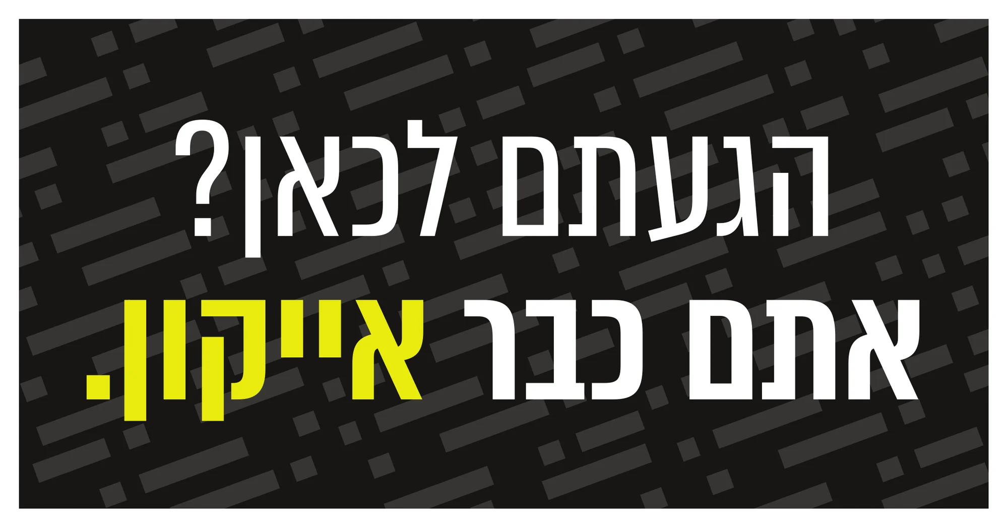
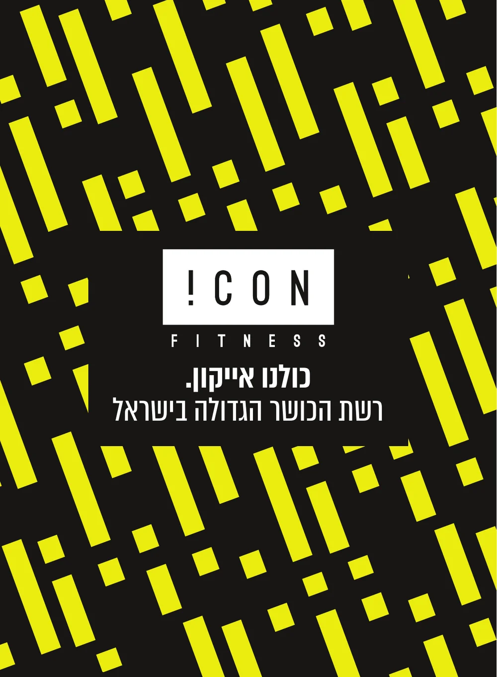
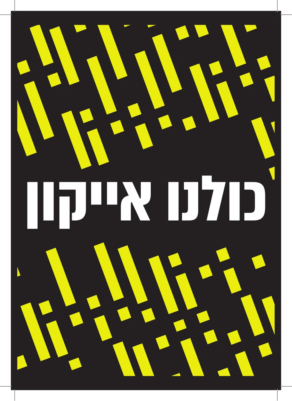
A new brand identity and strategy for 2026 for Icon, Israel’s largest gym chain. One idea runs through everything: “כולנו אייקון”, we’re all icons. Whoever walks in, at any age and any level, already is one.
- Client
- Icon Fitness
- Role
- Brand identity, strategy & campaign
- Scope
- Logo, pattern, type, sub-brand, social, print, AI brand film
- Year
- 2026
The idea
A name that shouts.
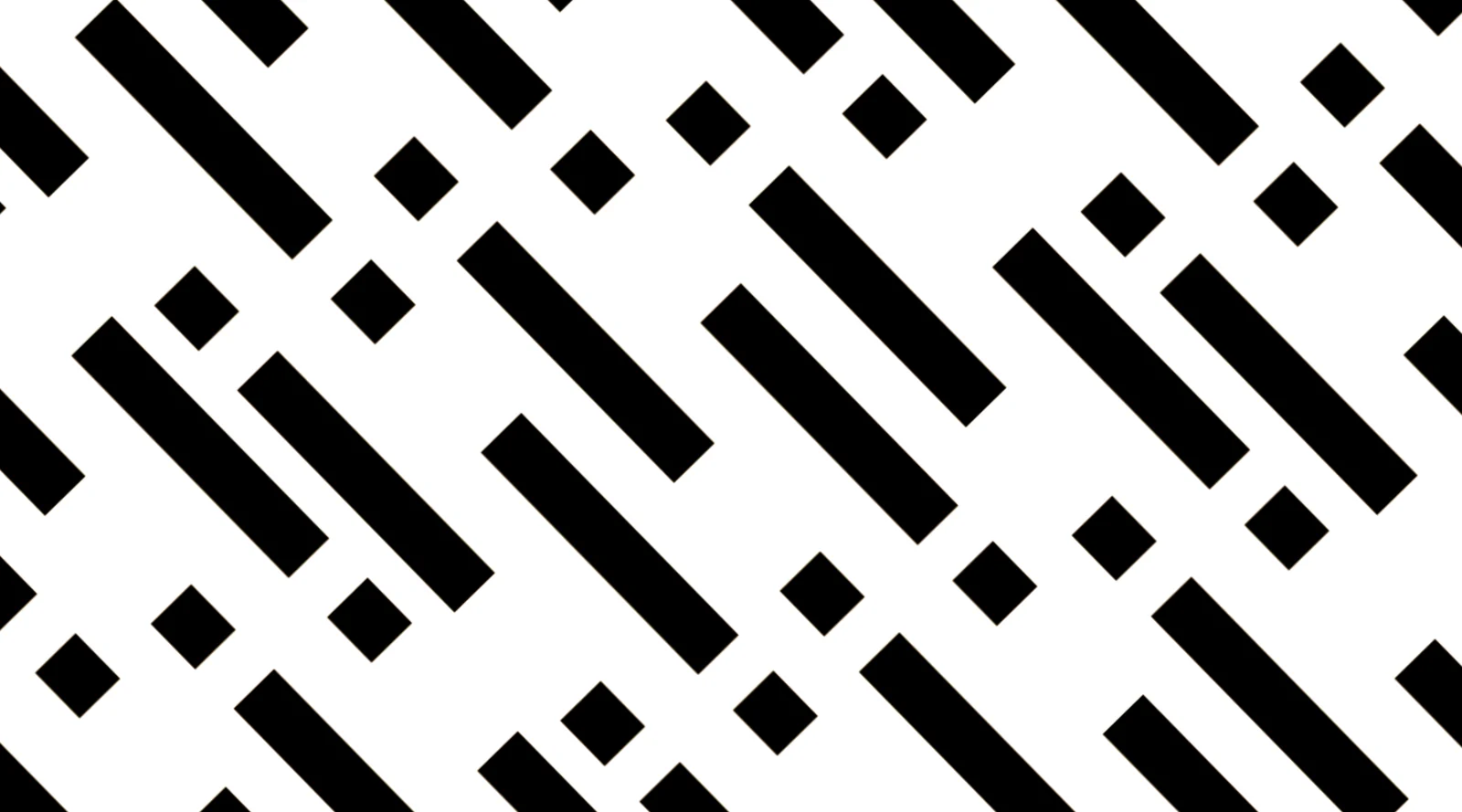
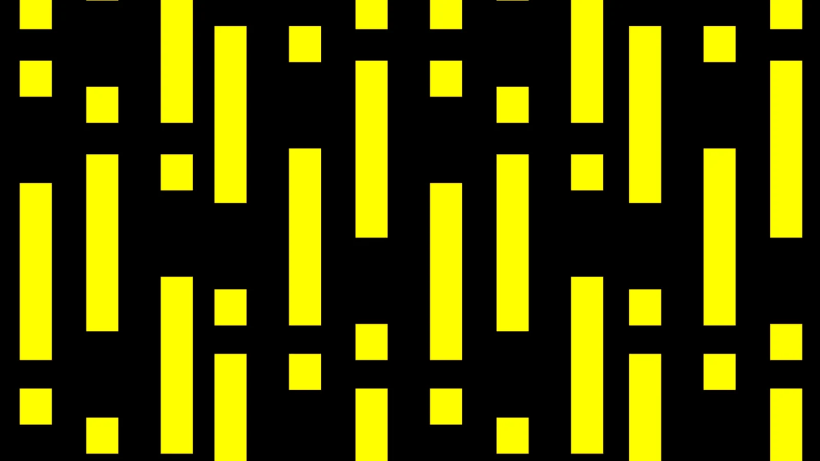
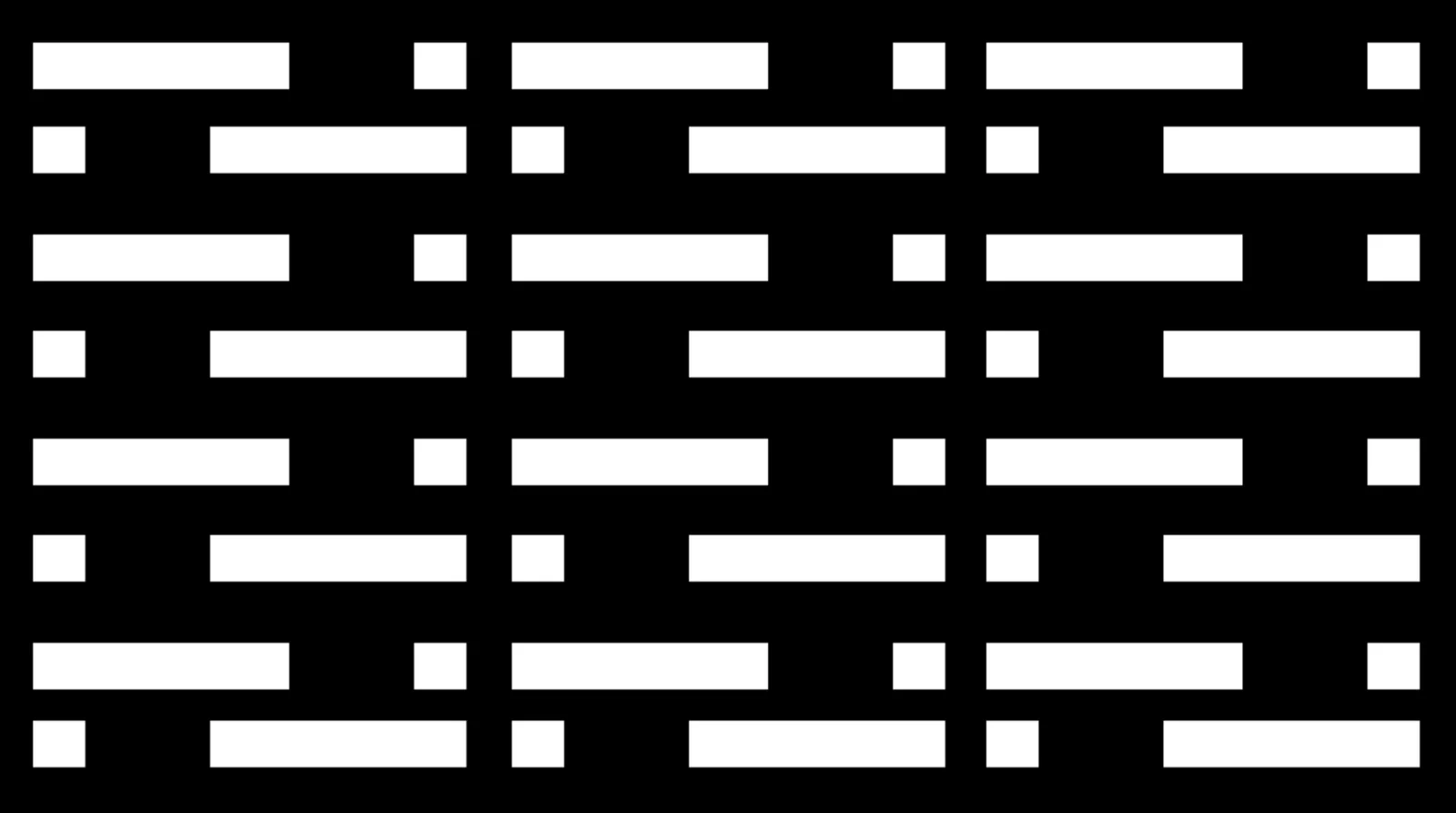
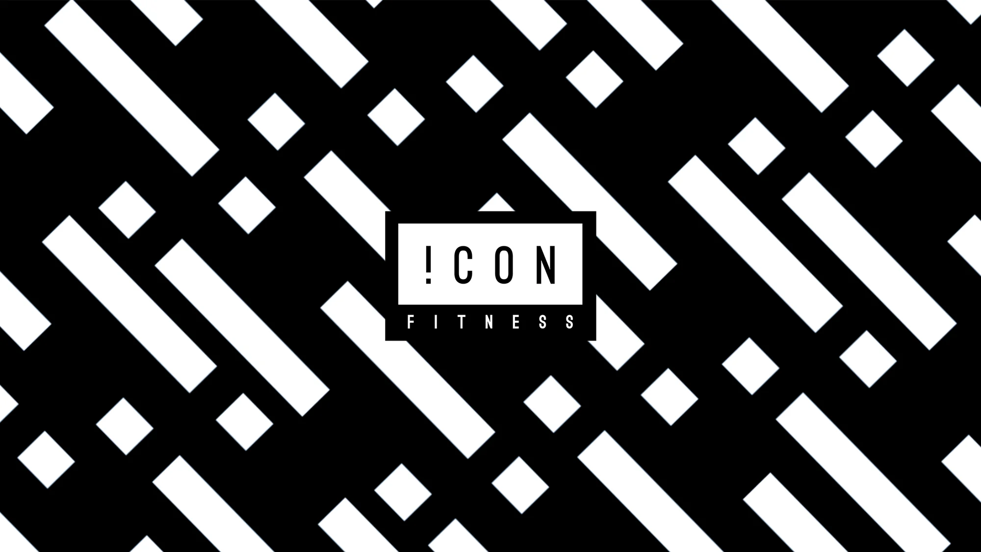
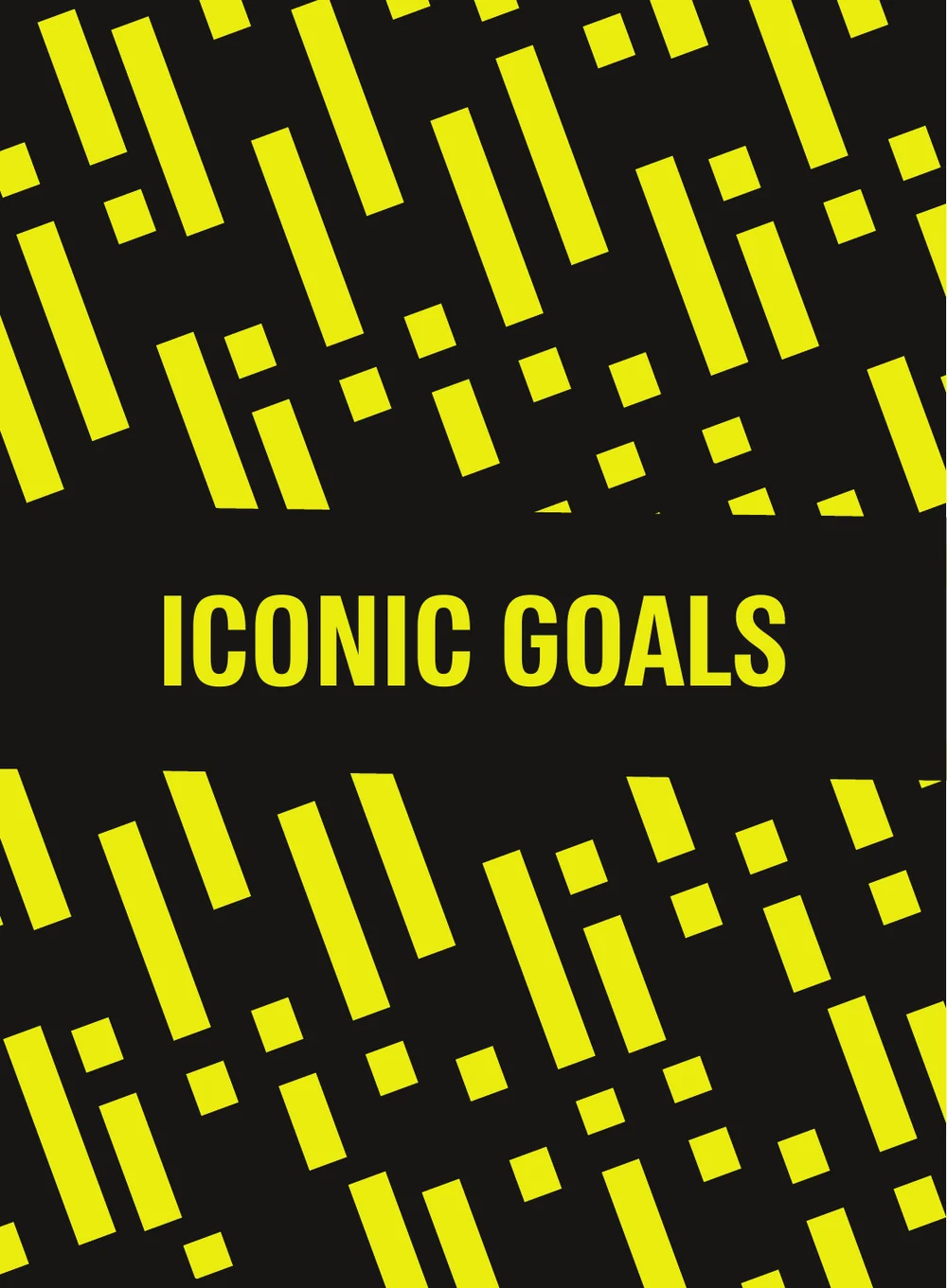
The exclamation mark takes the place of the I. It turns the name into a statement and gives the brand its building block: the same mark, stretched, tilted and repeated, becomes the pattern.
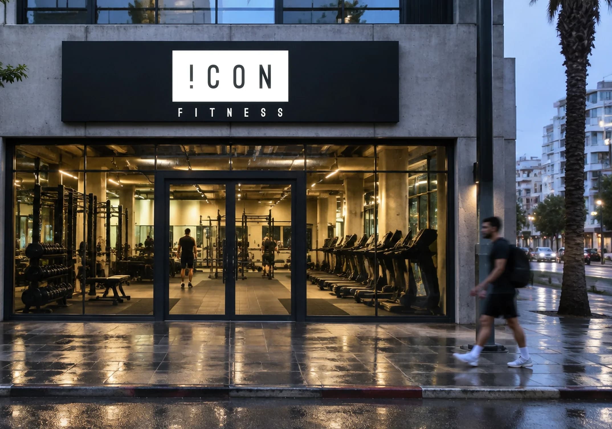
The logo keeps the white box members already know, redrawn tighter and taller, with a stand-alone version and a boxed “Fitness” line for tight spaces.
Colour & pattern
Black, white, and one loud yellow.
Four tiles of the same exclamation-mark pattern, horizontal, vertical and diagonal, in black, white and yellow.
- Graphite#4F4F4F
- Icon yellow#FFFF00
- White#FFFFFF
- Black#111111

Typography
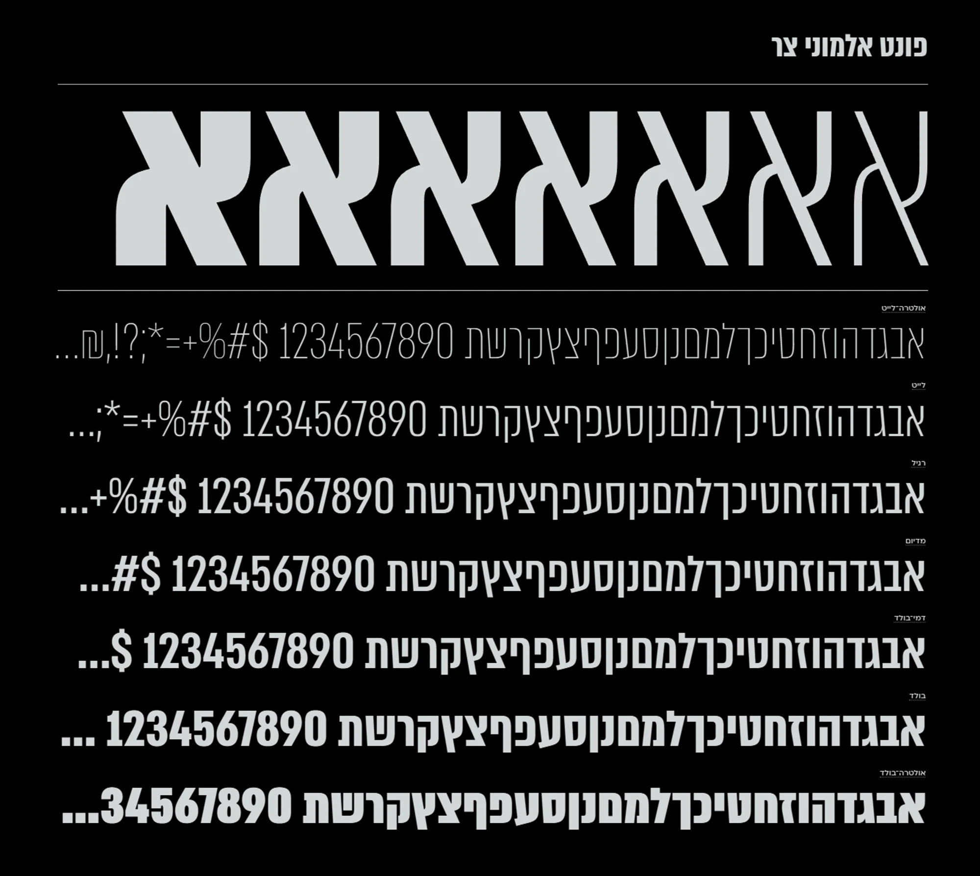
One narrow family, seven weights.
Almoni Narrow (אלמוני צר) carries everything, from ultra-light captions to ultra-bold headlines that fill the frame.
Sub-brand
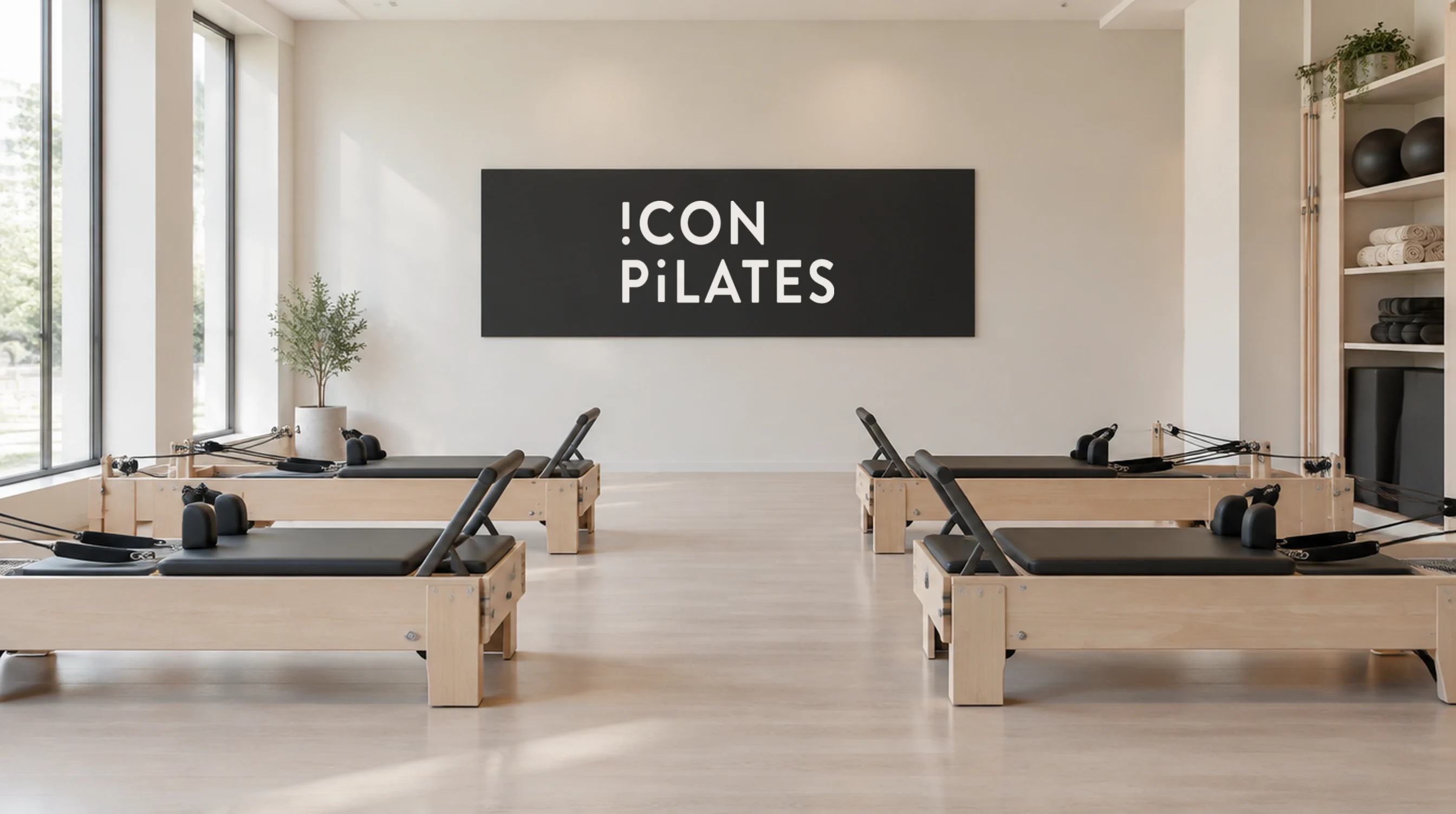
Icon Pilates.
A calmer sibling for the pilates studios: rounded capitals, the same exclamation mark, in black and white only.

Brand film
And what about you?
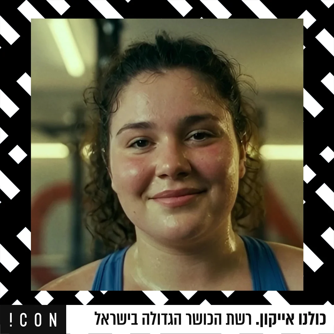
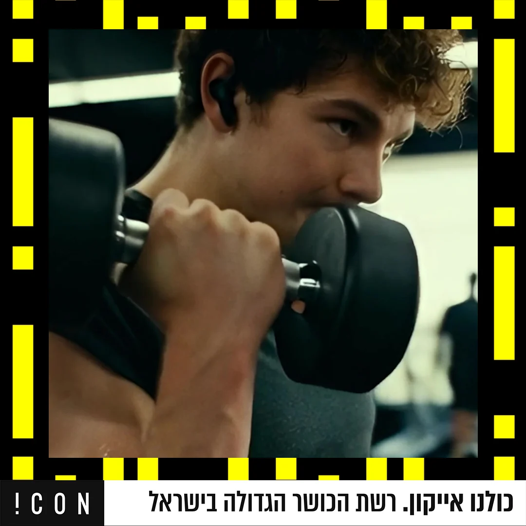
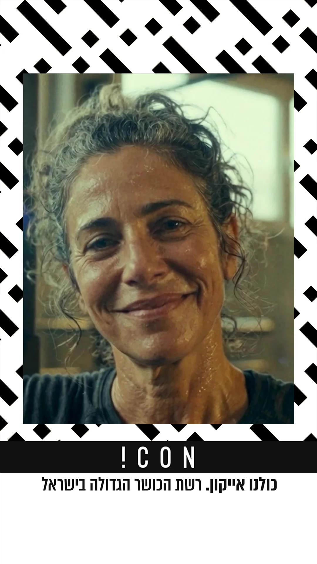
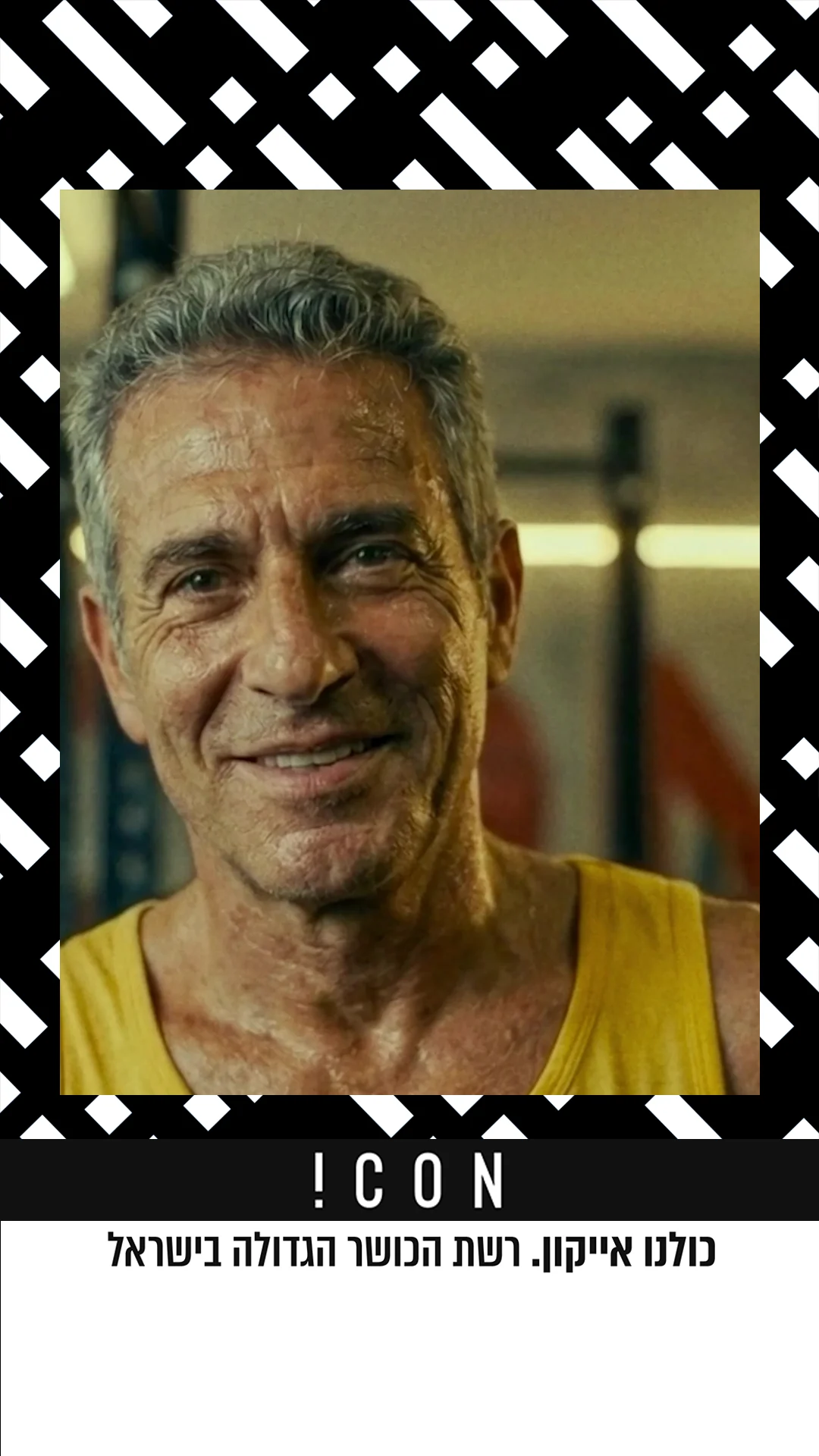
The AI-generated brand film lines up faces of every age and body, then turns the question to the viewer: and what about you?
Social system
Every member in the frame.
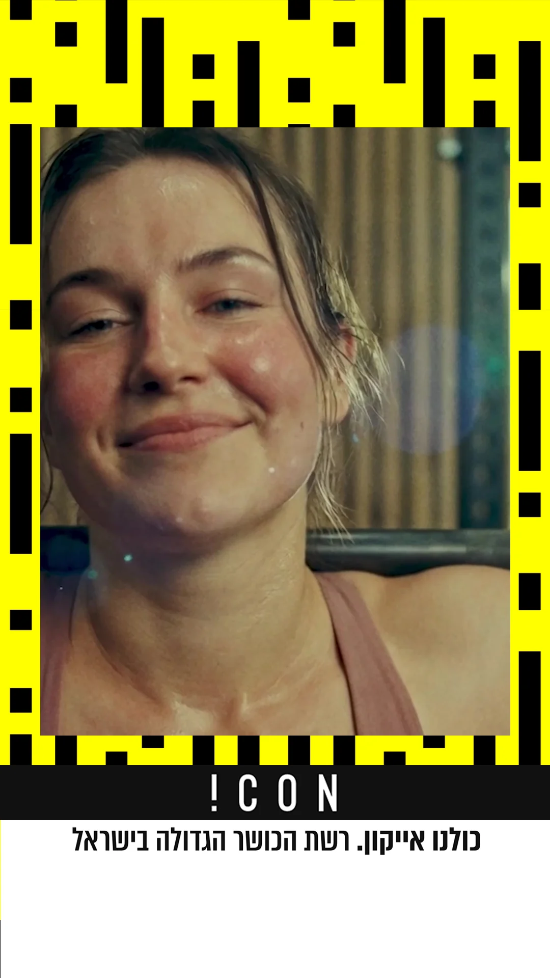
Templates that put members at the centre, framed by the pattern and signed off with the brand line, for feed and stories, plus channel covers and short cut-downs.



Print & merch
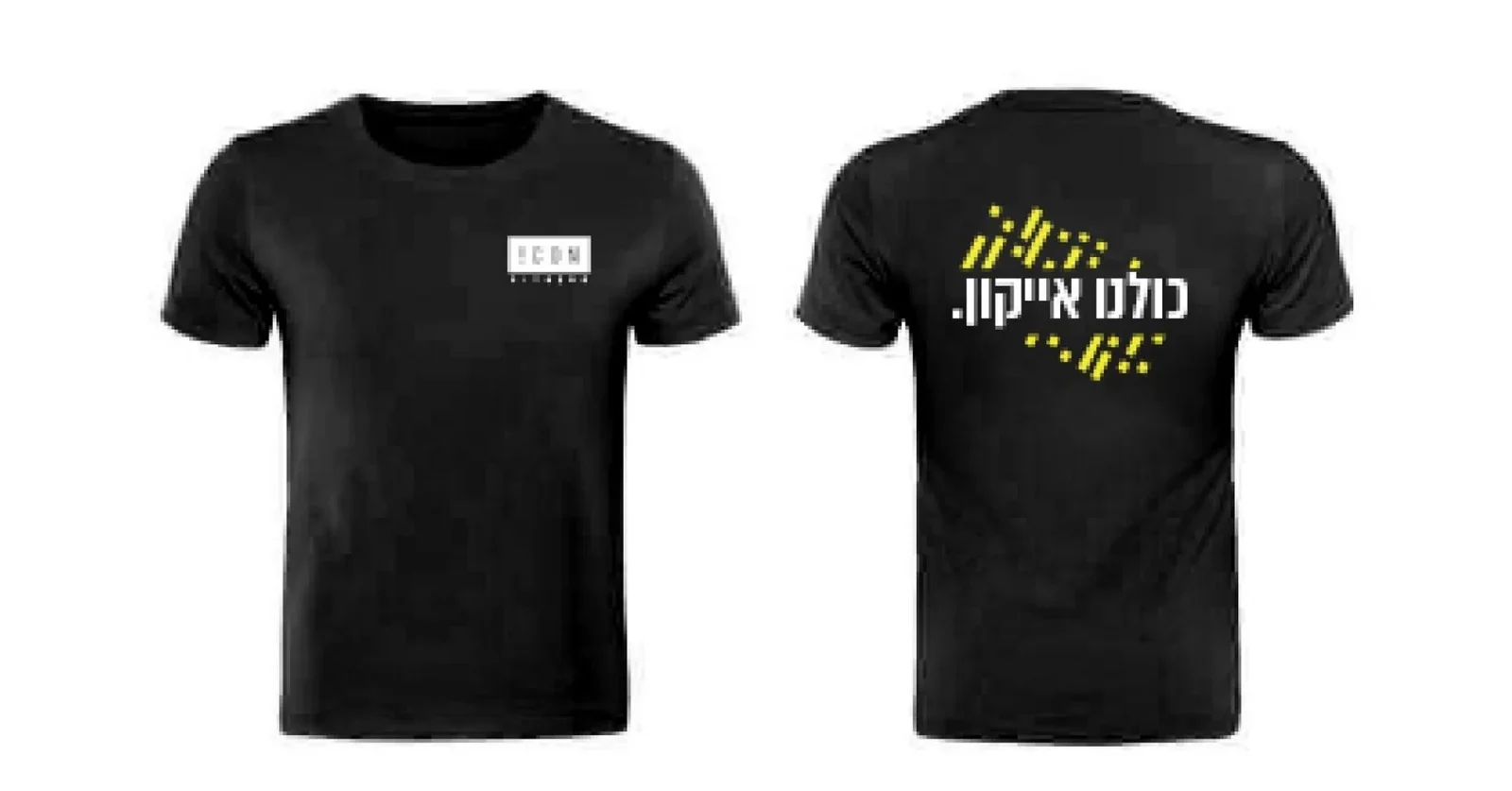
Wear the line.
Brand identity & strategy: Tair Efrati · Icon Fitness · 2026